Humboldt State University Campus Map
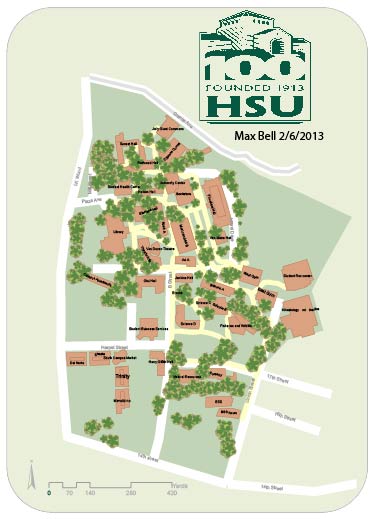
-Map made by digitizing key features across Humboldt State's campus
-Map shows where key buildings and roads are on campus
-Allows people to have a general idea of how the Humboldt State campus is structured
HSU Alumni Inforgram Map
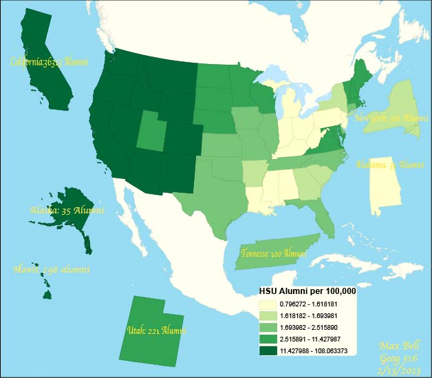
-Map using a choropleth layer to show what states have the most HSU alumni per captia
-Interesting states are pulled out and looked at more closely
-Map could be used to see what states HSU students will come from in the future
Arcata California Typography Map

-Map was created with Adobe Illustrator to draw the roads and important features of Arcata
-This map is completely done in Text
-Map can be use as a basic map of the city of Arcata and the surrounding features
Beer Tweets of America

-This map represents the volume of beer tweets in America and where they are coming from.
-The tweets are symbolized by graduated symbols to show the amount of tweets in that specific area.
-One can use this map to see where people are outspoken for their craving of beer
Broadband Connectivity

-Map shows places on earth with the most broadband connections.
-Map is a dot density map with each point equal to 100,000 broad band connections
-Points are placed randomly within the enumeration unit, so points do not represent exact location.
-One can use this map to see what places on the globe are more connect via high speed internet
Carbon Dioxide Emissions by GDP in USD

-A cartogram was used to show what countries release the most Carbon dioxide gas into Atmosphere.
-The choropleth layer shows the GDP for each country in US dollars
-The distortion of country size is based on CO2 emissions.
-One can use this map to see what countries are releasing the most CO2 and how much money they are making because of it.
Challenge Project: Hateful French Hashtags

-A point map that shows the locations of where hateful French Hashtags are being tweeted from.
-Choropleth layer shows what countries have the highest Twitter Traffic
-One can use this map to see and look at how and where french hate speech occurs.
-Choropleth layer shows what countries have the highest Twitter Traffic
-One can use this map to see and look at how and where french hate speech occurs.
